
PAW
PLANNER
Project Overview
Paw Planner is a mobile app that makes owning a pet as easy as possible. Appointments, medical records, and everything else in one place.
Problem Statement
Existing apps are outdated and don’t effectively solve today’s pet owners needs.
Design Process

The Double Diamond framework emphasizes divergent and convergent thinking. I explore a vast range of ideas and narrow them down to the most viable and user-centered solutions.
-
It is imperative that I immerse myself into the users' experiences to gain a deep understanding of their needs, challenges, emotions, and journey.
-
After gathering research and additional context, I organize my findings to deduce insights and patterns to clearly articulate the problem to solve.
-
With a clear problem statement in mind, I generate a wide range of ideas and low fidelity wireframes focusing on quantity over quality (we can refine them later!).
-
After narrowing down the best ideas, I build high fidelity mockups & prototypes to explore and test their feasibility, accessibility, and effectiveness.
1. Discover
Research Goal
Understand the major pain points of owning a pet and uncover the users’ goals, motivations, and frustrations.
Research Objectives
Understand major pain points of owning a pet
Learn how owners care for their pet
Uncover which dog apps owners currently use
Methodology
Interviews were conducted with 5 participants who currently own a pet or have previously. The focus was centered on understanding the major pain points of owning a pet and how the process could be made easier.
Findings
The top 3 pain points for existing apps are:
Managing appointments and important dates
Scattered medical records & other documents
Lack of resources on how to care for a puppy
Participants goals included…
Keeping their pet’s schedule separate from their personal calendar
Having a single place for all their dog’s information
Getting reminders for appointments and important dates
2. Define
Affinity Map
Interview responses and quotes were recorded and organized into an affinity map, where I sorted the findings into 6 categories.
I used this affinity map to create 2 user personas:
Nicholas, a new dog owner who just adopted a puppy, and
Megan, an experienced dog owner who needs a refresher on how to raise a puppy.


Feature Roadmap
Using these 2 personas, I created storyboards for each user, keeping their separate goals and interests in mind.
After creating a product roadmap and feature set, I started iterating different ideas for important screens in the form of sketches.


3. Develop
Brainstorming and Sketches
I started with the most important screens (Home, Calendar, Profile) to make sure I had a good understanding of the app’s foundation.
I drew inspiration from Google Calendar and other designs I saw online. I thought it would be good to make the calendar screens and flow familiar to users to limit the challenges.

Wireframes
Home: Dashboard where users can manage their pets’ profiles, view upcoming appointments, and read articles on popular pet topics.
Features: Pet profiles, upcoming appointments, tips & tricks (articles).
Calendar: View their dog’s upcoming appointments in chronological order and manage their notification settings.
Features: Events, notifications, change calendar of pet.
Profile: Houses all of the pet’s information in a single place.
Features: Basic info, medical records, vaccinations paperwork, photo gallery, history of events.
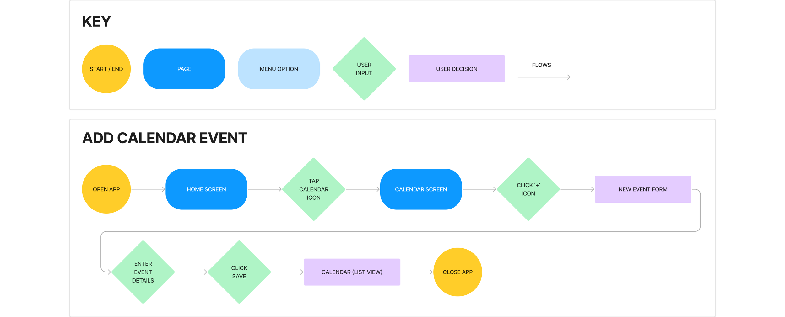
Task Flow
The most important task flow is the ‘Create an event’ screens in the Calendar.
In this flow, the user creates an event or appointment to remind them in the future.
4. Deliver
Branding
I chose a lavender for the primary color as it looks peaceful and soft. I went with a gold for the secondary color, as it is the opposite of purple and I wanted the CTA’s to contrast well. All colors and combinations were checked for accessibility with WebAIM.
The headers use Asap as the typeface, while the body is SF Pro. I like the subtle shapes of some letters which made for fun headings. Since the copy is smaller and Asap is more intricate, I went with SF Pro (a simpler, more legible typeface) for the body copy.

Prototype
After updating my wireframes with the new branding, I created a high fidelity prototype for the ‘Create an event’ flow to test with new participants.

Usability Testing
Usability testing was conducted with 5 new participants who have currently own or have previously owned a puppy. Interviews were conducted to see if users could intuitively create a calendar event on the prototype.
Research Goals:
Learn how users navigate through the ‘Creating a calendar event’ flow
See if users can complete task without help
Identify any areas for improvement
Task Flow:
Create a new calendar appointment for a vaccination on May 14th at 12:30 PM.
Findings & Insights
All of the participants completed the task without error, each taking less than 1 minute to complete the task. There was no issues or feedback for the task flow.
Regarding the other screens, participants stated that the ‘See all’ text buttons were hard to read and that there was too little contrast between the light purple and light gray Upcoming Event and Past Event cards respectively.
I increased the weight of the ‘See all’ text and changed the past event cards to from gray to white.
Measures of Success:
80% of participants (or more) can complete the task without error
Time on task: 1 minute (or less)


