
WAYFARER travel co.
Project background
Wayfarer is a place for travelers to discover new locations to visit around the world.
Although it doesn’t directly sell trips, flights, or accommodations, people use it as a tool for researching where to travel.
Wayfarer’s target audience is anyone between the ages of 21 and 30 who travels frequently and is in search of new adventures.
Requirements
1) Design a homepage users will see when they first find Wayfarer.
Must include:
Navigation to other pages or sections on the site
A brief explanation of what Wayfarer is
Simple search functionality to find destinations
A grid or list view of featured destinations (these would link through to further details)
A call-to-action to sign up for the newsletter
A footer section that at least includes a copyright date and some links to other pages
2) Design 3 screens for a mobile app that gives users more information about destinations.
Must include:
Consistent design with the landing page
Screen 1: List of destinations
Screen 2: A “Details” screen – gives more info about a destination
Screen 3: One of the following:
Sign-in screen
Search screen
Account settings screen
1) Homepage

Research
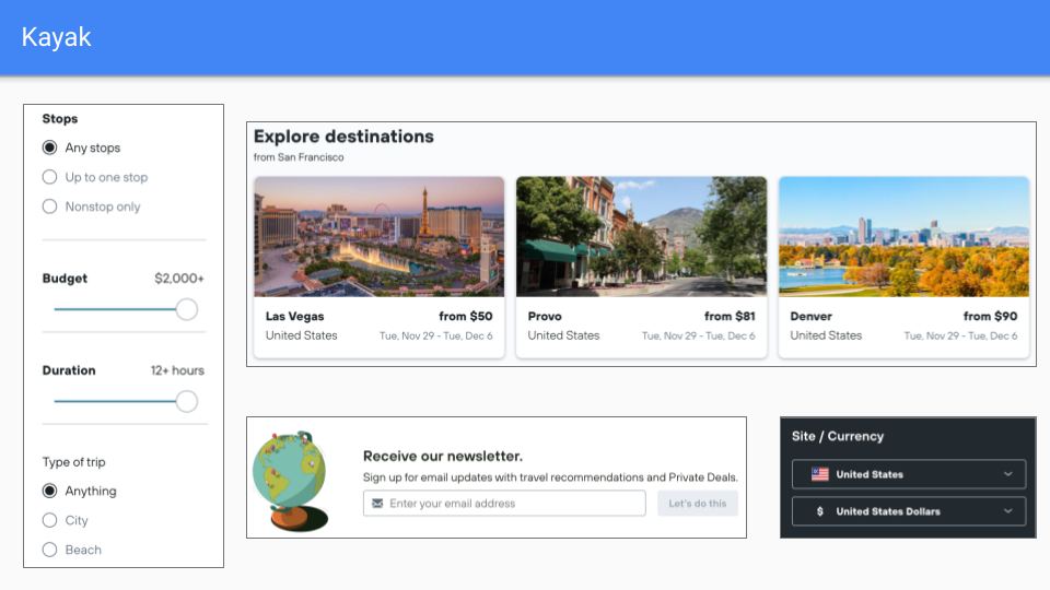
I started by brainstorming as many ideas as I could think of before researching direct competitors (Kayak, Expedia, Tripadvisor, Google Flights)
Next, I gathered research on these companies and organized findings and inspirations in a mood board.
I put the pieces I liked the most together to make a rough wireframe of a landing page.


Mockups

For the hero section, I wanted to use a captivating image that sets the tone of the rest of the website and explains what Wayfarer is.
I added a search bar to encourage users to explore any idea and show that they didn’t need to have a destination in mind.
I also wanted users to see the Featured Destinations header above the fold, making it more intuitive to scroll down for additional content.
For each destination, I included only the details users needs to determine if they want to learn more, along with a bookmark feature.
To further encourage exploration, I thought users may find it useful to see a list of destinations based on what experience they sought (Tropical, Hiking, Mountains, Desert, etc.).
I chose the image of the woman looking out on the mountain range for the newsletter CTA because it felt warm and encouraging to new travelers, who may be starting on their own.
In a similar vein, I added a section underneath for blog articles that give pointers to new travelers.
These articles are intended to give new travelers some tips and tricks but also to show users what kind of content they can expect to see in the newsletter.
Lastly, I added links to other pages and other areas of interest into the footer (including social media profiles).
There is an option to change the currency and country/language of the rest of the site’s pages.
2) Mobile app screens

Mockups
I started with the Sign-in screen because I felt like it was the least complicated.
Since this is the first screen a user will see upon opening the app, I wanted the background image and heading to be consistent with the landing page (to build a sense of consistency).
I added the Wayfarer logo to the top left (similar position as the landing page) and added buttons to Sign Up or Login.
I chose turquoise as the color scheme because it feels light, fun, and tropical.
For the Destinations screen, I wanted to keep the same theme of exploration by including different ways a user could narrow down a group of destinations.
I put categories like ‘All, Featured, Most Viewed, and Recommended’ in addition to using the ‘Explore by Experience’ section from the landing page.
I also incorporated the search functionality in case a user knows what they’re looking for.
I wanted the Details screen to have as much information as possible without feeling like a Wikipedia article.
I added an image carousel at the top so users can swipe through pictures at a glance.
I made sure to include the destination’s rating and reviews at the top, since that is an important factor to most travelers.
Because “a picture is worth a thousand words,” I used photos to show off the Top Attractions and Popular Things to Do (users can tap on an image to expand more details).
Lastly, I added an FAQ section to answer the most common travel questions regarding this destination.